


Paint and color are one of the least expensive and most impactful ways to customize your space. Color is not simply used to dress up a room. Color is used to shape energy and sway emotions. It can reflect a person’s personality, express individuality, and can shift a person’s mood. Color can be what helps set your space apart, and make people remember you. And in a world where everyone seems to just want to fit in, we encourage you to stand out!
As designers, we take a thoughtful and precise approach to color choices and it’s all about achieving the desired effect. Did you know that the right colors can actually change the look and feel of your space? Did you know that color can actually change the way you feel? This is not some new-agey hype, experts have been studying ‘Color Theory’ since the early 1400s. Color and the way it is applied, are principles considered by Interior Designers, Graphics Designers, Marketing Teams, Product Designers, and Fashion alike.
There is a wealth of information available about color symbolism and meaning. Every hue has its own characteristics, and every variation has a purpose. When it comes to design, it’s not just about picking a color; it’s understanding how that color – and its variations can affect space and create a mood. At BMor Creative, we feel the ultimate goal for any renovation, whether it be a local eatery, small business office space, or historic home, is to express the personality of its inhabitants and contribute productively to how they use their space.
Temperature
Colors are classified by temperature: warm to cool. On the spectrum, blues, purples, most grays, and blue-greens are considered cooler colors; while reds, yellows, yellow-greens, oranges, browns, and tans are considered warmer.
Cool colors are known for their calming effects. They invoke mental pictures of water, mountains, wintertime, or an overcast sky – Natural Elements. And just as in nature, these elements can have relaxing and calming effects on a chosen space. Cool colors also tend to make a space feel larger and more expansive, receding visually. This makes cooler colors a good choice for smaller spaces and rooms or any environment you want to promote as calming or relaxed.
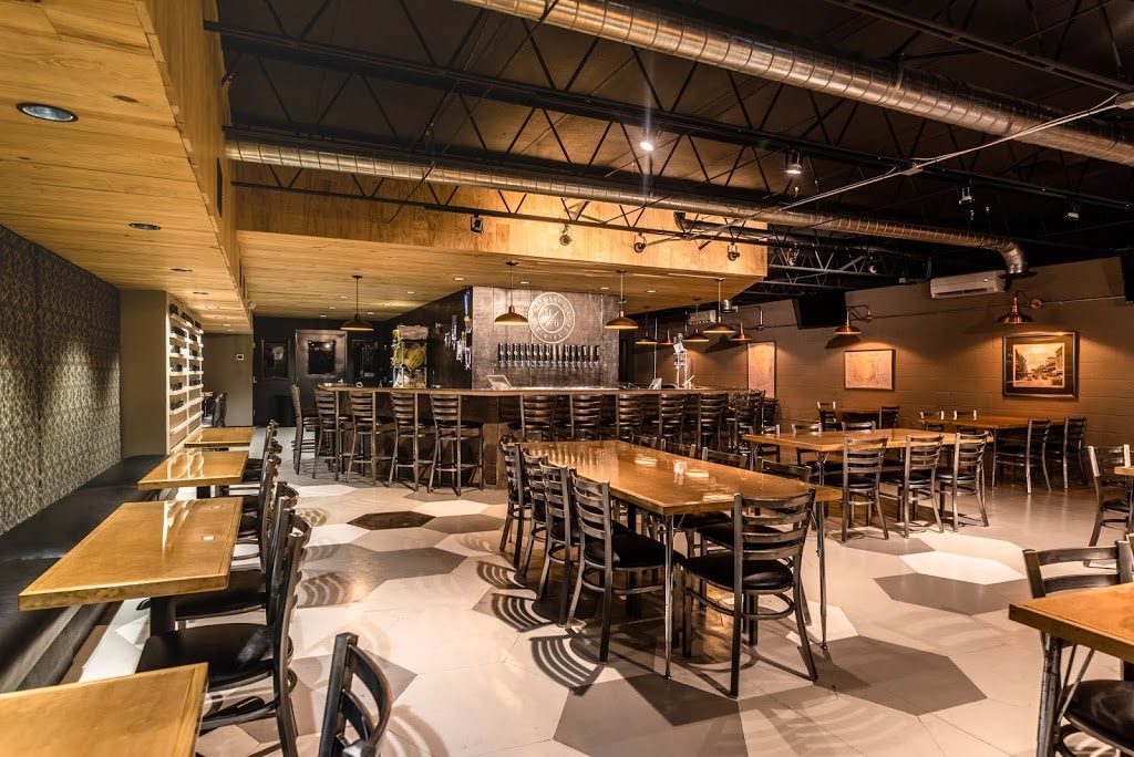
Main and Sixth Brewing, Historic Springfield | Jacksonville, FL | Photo: Miguel Emmanuelli
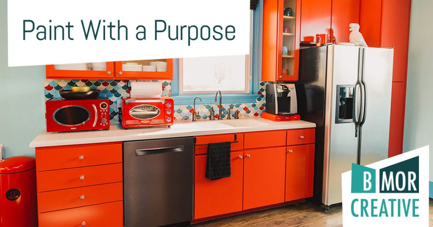
Warm colors tend to bring out a sense of excitement, physicality, and energy. Think of the sun, sand, red clay, or fire – Natural Elements that embody warmth, physically and psychologically. Warm interiors make spaces feel more inviting and comforting. Often you’ll find public spaces in homes, restaurants, hotels, and nightclubs dressed in warm colors. And while cooler colors help expand a space, warmer colors help make larger rooms more intimate, creating a more human scale. Super high ceilings in a living room? Paint the walls and ceiling a warm neutral – it will suddenly feel more intimate and cozy.
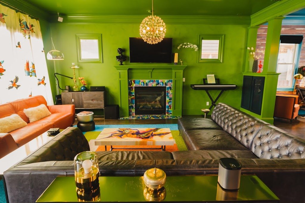
King Residence, Historic Springfield | Jacksonville, FL | Photo: Miguel Emmanuelli
Now that you’ve narrowed down the color, it’s time to pick the perfect shade. But how do you know which green will work when there are over 50 to choose from? Understanding saturation can help.
Saturation
Saturation is best described as the intensity of color. Bright and bold colors, the purest and least modified from their true hues, are highly saturated. Softer, more muted versions of the same colors, created by adding black or complementary colors, are less saturated.
Highly saturated colors are visually stimulating and give off a sense of energy, excitement, and optimism. Think of an exercise gym, a Miami nightclub, or a children’s daycare center – places where energy and enthusiasm are implied and intended. It’s easy to envision those places with bright and bold color schemes. Saturated colors are also used to highlight an area or as an accent, drawing attention to a specific spot or room.
As designers, we love using bursts of color to act as signage, as well as contrast to shape large spaces or make a certain color really pop! However, you must proceed with caution. Too many bright colors or colors paired with its complementary companion can be overstimulating. The objective is to create a place for the eye to rest, not a sense of visual anxiety.
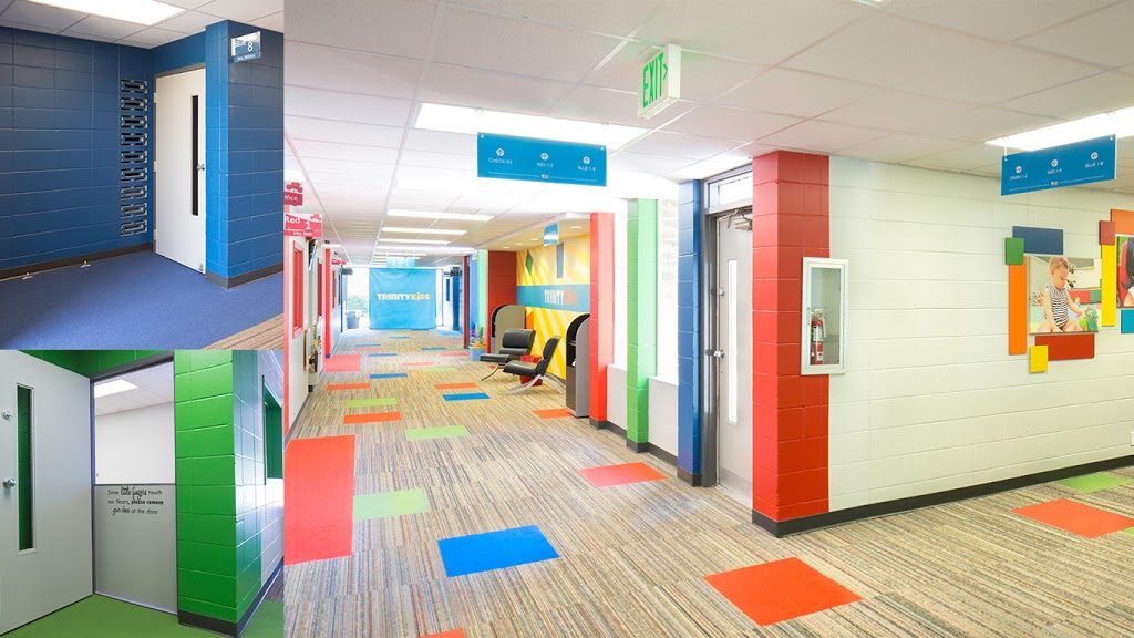
Trinity Baptist Pre-K | Jacksonville, FL
Less saturated colors are more peaceful and serene and provide a calming effect. They promote rest and relaxation and help lower negative emotional responses such as anxiety and fear. Is it any wonder these colors are commonly used in spas, mental health facilities, and areas of tranquility in homes, such as bedrooms and bathrooms? Just as too many bright colors can be overstimulating, too many muted colors make a room depressing. So, keeping it to a splash of color is sometimes what you want when looking to liven up a room.
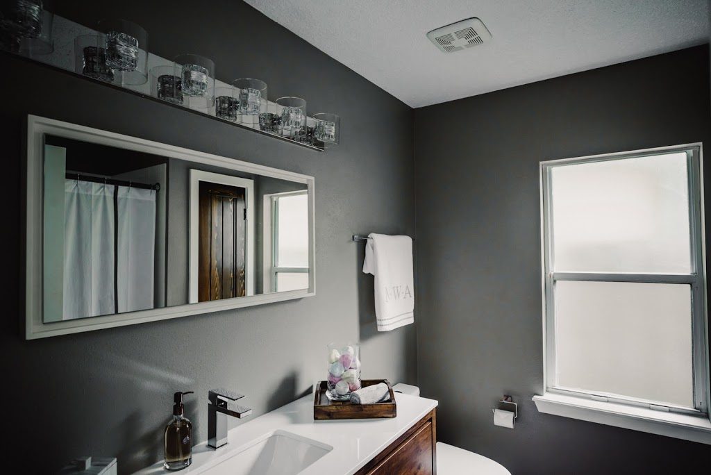
Archer Residence | Jacksonville, FL | Photo: Miguel Emmanuelli
Still not sure?
Are you stuck between a few options? Color is one of our specialties at BMor Creative. We have years of experience in selecting the right palette for each client’s unique needs and personality. If you are feeling overwhelmed, you’re not alone. One of our clients’ biggest fears is picking the wrong colors. Not only do we offer full Interior Design, including Project Management and Construction services, we also offer color consultations.
Not sure how to pull it all together? We would love to share more of our passion and expertise in the world of color with you! Schedule a consult with us today, we’d love to help.
BMor Creative is a full-service interior design firm, specializing in commercial interior design and historic preservation for small business.